There is a design language emerging at the intersection of laboratory precision and luxury fashion. We call it the Clinical Boutique aesthetic — a style that borrows the sterile cleanliness of research dashboards and wraps it in the editorial elegance of high-end print magazines.
The Noise Layer
One of the simplest yet most transformative techniques is the noise overlay. A global SVG turbulence filter at 0.05 opacity eliminates the flat, plasticky feel of pure CSS gradients. It gives the entire interface the tactile quality of film photography — organic, textured, alive. The noise should be fixed-position and pointer-events-none, covering the entire viewport without interfering with interaction.
Typography as Architecture
In this aesthetic, typography is not decoration — it is the primary structural element. We pair Plus Jakarta Sans for headings and UI text with Cormorant Garamond for editorial accents and pull quotes. The contrast between geometric sans-serif and classical serif creates visual tension that keeps the eye moving.
Scale matters enormously. Hero text at 10rem or larger, body text at comfortable reading sizes, and mono-spaced labels at 10px for that laboratory instrument feel. The hierarchy should be so clear that you could remove all color and still understand the information architecture.
Color as Atmosphere
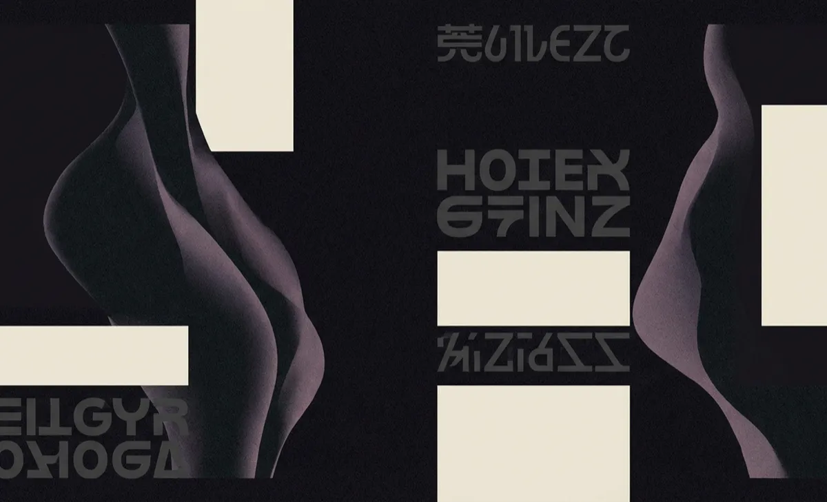
The palette is deliberately restrained: a near-black background (#0A0A0A), warm off-white text (#F2F0E9), and two accent colors used sparingly. Purple (#9E3CF3) for interactive elements and yellow-green (#EFFF96) for highlights. This restraint is what makes the occasional burst of color feel significant rather than noisy. Every colored element earns its place.